
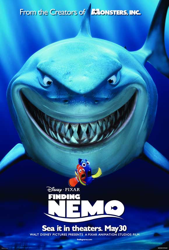
The genre of this film is a children's/kids film. The genre conventions referred to are fish and animation. The conventions of the form are quite conventional because it has the release dates the same of the film, but doesn't have names of the actors. The mise-en-scene is very bright and colourful which attracts the kids attention and will make them want to go and watch the film, also by the release date it has a pun where it says 'Sea it in theaters. May 30'. The symbols used in the poster that it has a fish instead of the middle circle in the O and all the font and pictures are based around fish or disney pixar, but the audience dont really need to decode the symbols because they're quite obvious. The main figures in the poster are the 2 main characters and one of the big characters in the film, and are based in the film of the sea. The layout of the poster affects its message alot, because its very clear and easy to read and attracts peoples attention. The designer has chosen to use this particular typeface because the whole poster is based around fish and the sea, and the writing really stands out by the blue background. The visual camera effects that the writer/ designer has decided to use is a wide shot because it has alot of the shark in the shot. The messages in the poster are mainly visual because there isnt much text. The audience intended is children and maybe some teens and maybe some people that are interested in animation or pixar films. The persuasive techniques used in the film poster are things like bright blue colours and fish that stand out. The unique selling point is the sharks relationship with the fish and where it says 'From the creators of Monsters Inc'. The expert witnesses aren't quoted.
No comments:
Post a Comment